A wide feature set
Balances, transactions, expenses, checks, taxes, and commissions need a predictable place in the product.


DineroSync / Case study 02
A connected workspace for understanding balances and managing everyday financial operations.
Organized the financial modules, developed the dashboard hierarchy, and shaped recurring interface patterns.
01 / OVERVIEW
DineroSync brings cash flow, expenses, commissions, taxes, and branch-level operations into one financial-management product.
The client already had an MVP. The brief was to strengthen its clarity, consistency, and sense of trust while creating room for additional capabilities.
How can people move from understanding their financial position to taking action, without losing context?
02 / CONTEXT
A business owner needs an overview. A finance manager needs visibility across operations. An accountant needs to find and work through records. The product has to support these different tasks without making every screen carry the same level of detail.
Balances, transactions, expenses, checks, taxes, and commissions need a predictable place in the product.
Financial information needs clear labels, legible values, and consistent hierarchy so users can interpret it with confidence.
The existing MVP needed repeatable patterns that could support more modules without fragmenting the experience.
03 / DESIGN DECISIONS
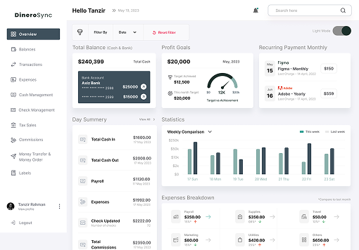
Bring the day summary, cash and bank balances, charts, and alerts together. Users can understand the broader financial picture before opening a specific module.
Design intent: separate the overview from the detailed records while keeping navigation between them direct.
Group work into recognizable modules: balances, transactions, expenses, cash management, checks, taxes, commissions, money transfers, and branches. Persistent navigation makes the product easier to scan and revisit.
Trade-off: a broad system needs careful grouping so useful access does not become an overwhelming menu.
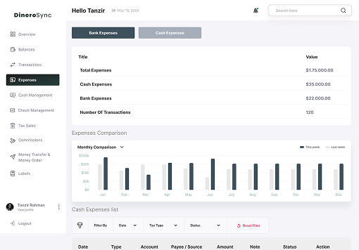
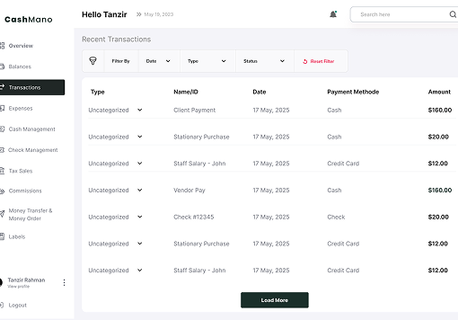
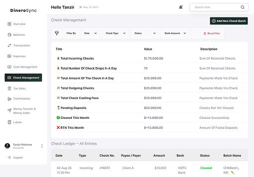
Place the module summary before its detailed records. Use tables for transactions, clearly labeled actions for changes, and consistent filtering patterns across financial tasks.
Why this matters: understanding one module should make the next one easier to learn.
Use restrained surfaces, readable type, and structured emphasis. Stronger colors identify navigation and important actions while the data stays visually prominent.
Design intent: build trust through clarity and consistency across the product.
04 / INFORMATION ARCHITECTURE
Establish the user’s context as an owner, finance manager, or accountant.
Review balances, financial summaries, and alerts.
Move into the transaction, expense, or other financial task.
Use the module’s details and actions to complete the work.
The structure supports a central overview and dedicated operational areas. Branch organization and consistent module patterns provide a foundation for a broader financial product.
05 / UI SYSTEM
The interface uses a recurring structure: a stable navigation area, a module summary, and detailed records with contextual actions. This creates continuity as the product expands.
Keep navigation and account context in predictable positions.
Separate headline values, comparisons, and individual records.
Use consistent treatment for adding, filtering, and inspecting information.
Keep active, selected, empty, and error states distinguishable.
Check text and control contrast, keyboard navigation, visible focus, and readable financial values. Pair status colors with clear labels so information remains understandable without color alone.
06 / THE INTERFACE
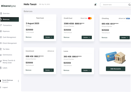
The dashboard establishes the financial overview. Account, expense, and transaction screens then reveal the detail needed for day-to-day operations.
07 / VALIDATION PLAN
Proposed usability checks for the next iteration. These are evaluation plans, not completed research findings.
| Task | Question to answer | Signal to observe |
|---|---|---|
| Find a specific financial module | Can a user predict where the task belongs? | First-click accuracy and time to find the module. |
| Interpret the dashboard | Can users explain the balance and comparison information correctly? | Interpretation errors and confidence. |
| Complete an expense task | Can the user find, inspect, and act on the relevant record? | Task completion and points of hesitation. |
08 / OUTCOME & LEARNING
The design brings a shared navigation structure and visual hierarchy to a wide set of financial tasks. Overview screens and detailed records have distinct roles within the same experience.
I would test whether people can find the right module, interpret a financial summary, and complete a common task without assistance. Task success, time to find information, and interpretation errors would guide the next iteration.
Next project / MoonsJob